Yes, your jewelry collections are stunning. The images are getting tons of views, too. But the sales still remain zero.
No, it isn’t your jewelry. Your photos are doing it dirty. Maybe that sapphire looks dull, or your white gold has a weird silver tint. Perhaps everything's just a little... off.
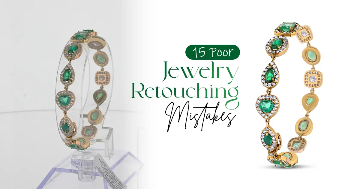
These are all editing eros. Here are the 15 jewelry photo editing mistakes that are costing you customers:
Over-polished
Incorrect Color Representation
Removing Natural Shadows
Harsh Light Reflection
Inconsistent Background Tones
Excessive Noise Reduction
Ignoring Scale
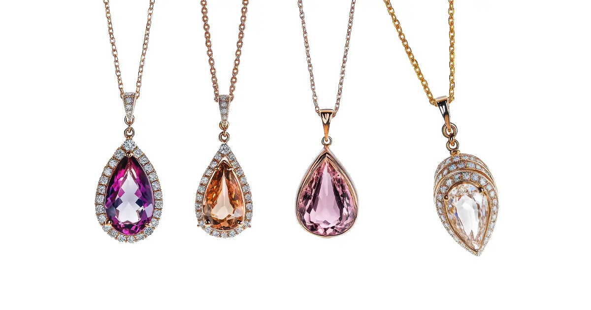
Dull Gemstone
Over-sharpness
Poor Dust and Scratch Removal
Misaligned Stones
Uneven Lighting
Overuse of Glow or Soft Filters
Ignoring Brand Style
Skipping Final Color Profile Adjustment
Don't panic! Most editing mistakes are surprisingly easy to fix once you spot them. Find the retouching blunders and the fixes.
Check out: Product Photography Techniques
What Makes a Jewelry Photo Editing Mistake Cost You Sales?
Yes, the jewelry you are selling is gorgeous. But are the photos you posted doing justice to those stunning pieces? Remember, your photos speak on behalf of your brand. If the jewelry photos look:
Visually inconsistent
Overly edited
Incorrect colors
Then, my friend, you're losing sales before even impressing the customer in person.
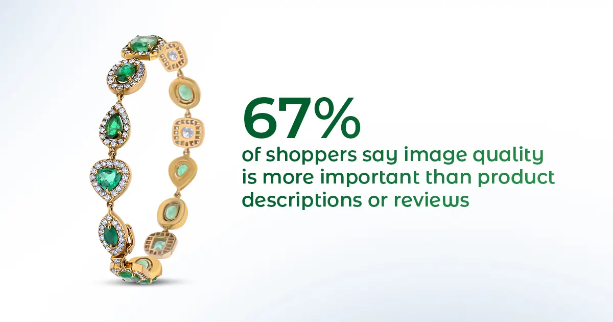
High-quality product photos get 94% more conversions than low-quality ones. That means almost twice as many sales! See, your customers can’t touch or try your jewelry online. So, your photos have to create an impression.
However, what happens when you edit the images way too much:
When your necklace photos look different from your ring photos. Different lighting, different backgrounds. People wonder if you're actually professional. It makes them less likely to trust your brand.
Too much editing isn’t good either. Overly polished jewel; it feels unnatural. It takes away its authentic charm. Nobody wants to buy something that looks artificial.
Incorrect color representation can mislead customers and cause dissatisfaction or returns. If your rose gold looks yellow in photos, expect unhappy buyers and refund requests.
Check out these 15 jewelry photo editing mistakes that are holding back your sales. Fix these issues, and you'll see that buyers will trust you more and start making purchases!
Excessive polishing can make jewelry appear overly glossy and artificial. It instantly kills buyer trust. Real gold has natural variations in its shine, not that fake, computer-generated glow.
The fix: Dial back your shine adjustments. Use selective brightening on specific areas. Let some areas stay naturally matte.
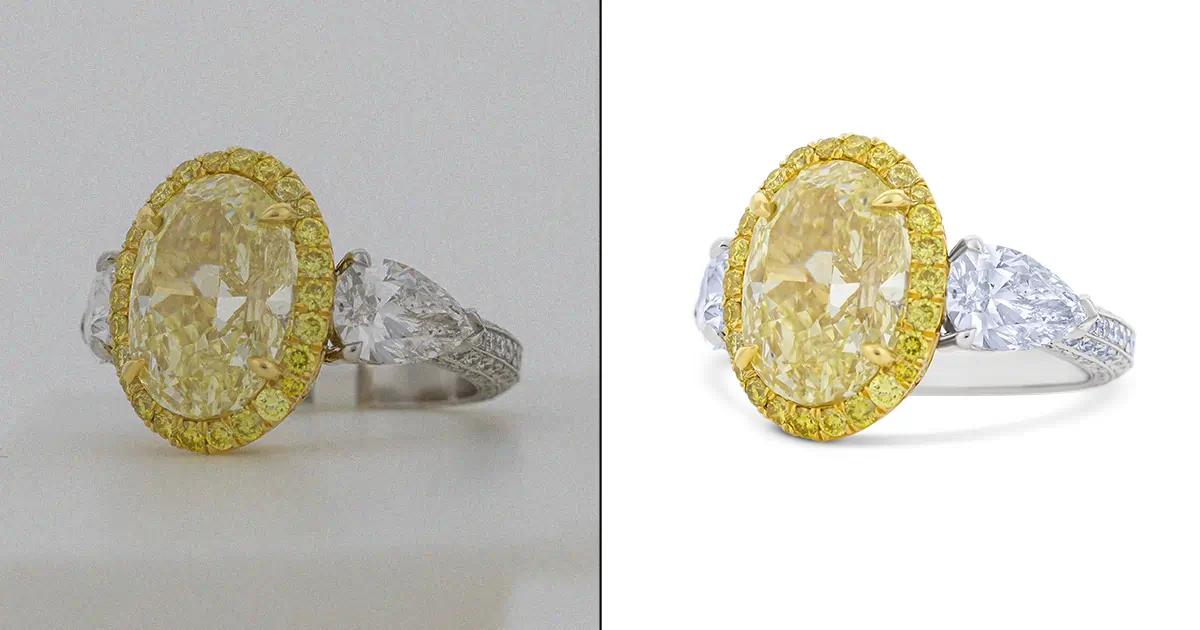
Rose gold turning straight-up orange? This is a huge problem. When your metal colors are off, customers receive something completely different from what they saw online.
The fix: Use white balance adjustment tools to correct color temperature and tint issues. Compare your edited photo to the actual piece under natural light.
Some editors delete shadows completely. Wrong move! Without shadows, your jewelry looks like it's floating in space. It looks totally unnatural and fake.
The fix: Keep soft, natural shadows that ground your jewelry. Just remove the harsh, distracting ones. Shadows give product photos depth and can ultimately lead to an increase in sales.
Blown-out white spots on diamonds? That's overexposure at its worst. When gemstone highlights are too bright, you lose all those beautiful sparkles that make gems special.
The fix: Use advanced editing techniques to handle harsh reflections. Reduce highlight intensity selectively. Make sure you can still see the gemstone's cuts and facets.
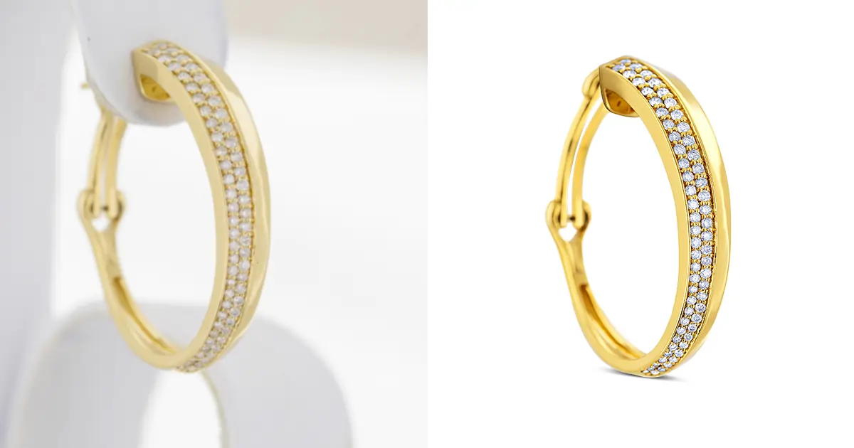
One product has a bright white background, and another looks grayish. It says "unprofessional" to shoppers. When backgrounds don't match across your catalog, it makes your products look like they're from different stores. Brand identity? Gone.
The fix: Create a standard background color code and stick to it for every single product. Use the same editing preset for background removal.
Sure, grainy photos are bad. However, completely smoothing them out is worse. When you overdo noise reduction, everything looks like it's been painted with watercolors.
The fix: Apply noise reduction selectively and lightly. Try to bring out the product's texture using selective sharpening tools. Keep some grain in the image to preserve texture. Zoom in to 100% while editing to see if you've gone too far.
Bad cropping makes it impossible to tell. When jewelry is zoomed in or awkwardly positioned, customers have no idea what the actual size is.
The fix: Include consistent scale references across your products. Keep similar items at the same relative size. Use standard cropping guidelines. Show detail shots separately if needed.
Nothing sadder than a vibrant sapphire looking like a sad blue blob. Gloomy gems don't catch the eye at all. Customers easily scroll right past them.
The fix: Use tools like Curves and Levels adjustment. It will fine-tune color balance, contrast, and brightness. Boost saturation slightly on gemstones (just a touch!). Increase vibrance to make colors pop.
See those weird glowing edges around your jewelry? That's called a halo, and it happens when sharpening goes wild. Those jagged, harsh edges destroy the luxury feel you're going for.
The fix: Use selective sharpening tools rather than blanket sharpening. Apply sharpness only to edges and details, not entire images. Use masking to protect smooth areas. Check your radius settings, too.
Visible fingerprints, or tiny scratches, tell customers one thing. You don't care about quality. Leaving these imperfections screams low-budget operation.
The fix: Use post-processing techniques. Try spot healing or cloning to improve clarity. Zoom in to 200% and scan the entire piece systematically.
Suddenly, a perfectly aligned row of diamonds looks wonky. For luxury jewelry, symmetry equals quality. If your editing makes things look crooked, buyers question whether the piece itself is poorly made.
The fix: Use rulers in your editing software before making adjustments. Never use free-transform tools on entire sections. Work on tiny areas at a time. Compare frequently with the original image.
Bright highlights at the top, dark shadows at the bottom. This breaks the visual flow. When lighting corrections are sloppy, viewers can't focus on the jewelry's beauty. Detail gets lost in both the too-bright and too-dark areas.
The fix: Use adjustment layers. Apply graduated corrections that blend smoothly. Use local adjustment brushes to even out problem areas.
That soft-focus Instagram filter might work for selfies. However, it's terrible for jewelry. You're creating a hazy mess instead of a crisp one. The piece looks like cheap costume jewelry floating in a fog.
The fix: Keep your catalog images sharp, clear, and detail-focused. If you want a softer look, adjust the lighting during shooting. Luxury jewelry needs to be clean, crisp, and confident.
Your gold bracelets are dark and moody? That's a problem. When each product photo looks like it came from a different store.
The fix: Create an editing preset to apply to every product photo. Document your exact settings. Your catalog should look like a family, not random strangers.
You spent hours editing, and the photo looks perfect on your screen. But then it looks completely different on your website. Too bright on mobile, or prints out with weird color shifts. That's because you forgot about color profiles.
The fix: Always export with an sRGB color profile for web use (it's the universal standard). Check your images on multiple devices before publishing.
Relatable reads: Smartphone vs Professional Photography
See, editing jewelry photos yourself is exhausting. You spend hours getting one ring perfect, only to realize your whole catalog looks mismatched. And those "quick fixes"? They usually make things worse. That's exactly why smart jewelry businesses hire professional retouching services.
Professional jewelry retouchers actually solve business problems rather than just editing a photo. Here is how:
Ensure accurate metal and gemstone color
They use calibrated monitors and proper color profiles
Take color correction methods to make jewelry look natural
Professionals recreate reflections by hand
The photos look grounded, not like floating in space
Enhance the sparkle, clarity, and overall appeal
Maintain the lighting, background, and color balance
Every single product in your catalog gets the same consistency
Professional services provide tailored solutions that meet platform-specific requirements
Help products stand out online and in print
Professional jewelry editors have years of experience. It is their job for almost 5 to 10 years. They don’t get tired of correcting again and again. You are basically hiring them because of their expertise, speed, and consistency. So, don't think, it’s just editing.
Besides, outsourcing jewelry photo retouching is very affordable. At least, it's cheaper than hiring in-house staff. It cuts down the overhead costs. Instead of paying a full-time editor, you pay only for what you need.
Every editing mistake you make costs you real money. From fake-looking shine to wrong metal colors, everything has to pay. The 15 mistakes we talked about. These are enough to destroy customer trust.
However, you don’t have to fix it all alone. Simply, hire an affordable professional jewelry retouching company. They have years of expertise and tools. With one order, you will see how the experts maintain enhancement and authenticity. So, contact RetPix today and try their free trial before trusting them. They will show your pieces exactly as they deserve to be seen.
You can use natural or diffuser lighting. Keep the background clean. Click the photos from different angles and focus more on the details.


RetPix, MB is a private company registered in Lithuania (No. 306112201) with VAT ID LT100015912712. We are delivering high-quality photo retouching, graphic design, and video editing services worldwide with a focus on precision and client satisfaction.
Follow Us
 English
 Arabic
 Danish
 Dutch
Dutch
 Finnish
 French
 German
 Hebrew
 Croatian
 Czech
Czech
 Greek
Greek
 Ukrainian
 Estonian
 Hungarian
 Turkish
 Italian
 Japanese
 Norwegian
 Polish
 Portuguese
 Romanian
 Spanish
 Swedish
 Russian
 Latvian
 Lithuanian
 Serbian
 Slovak
 Slovenian
 Luxembourgish