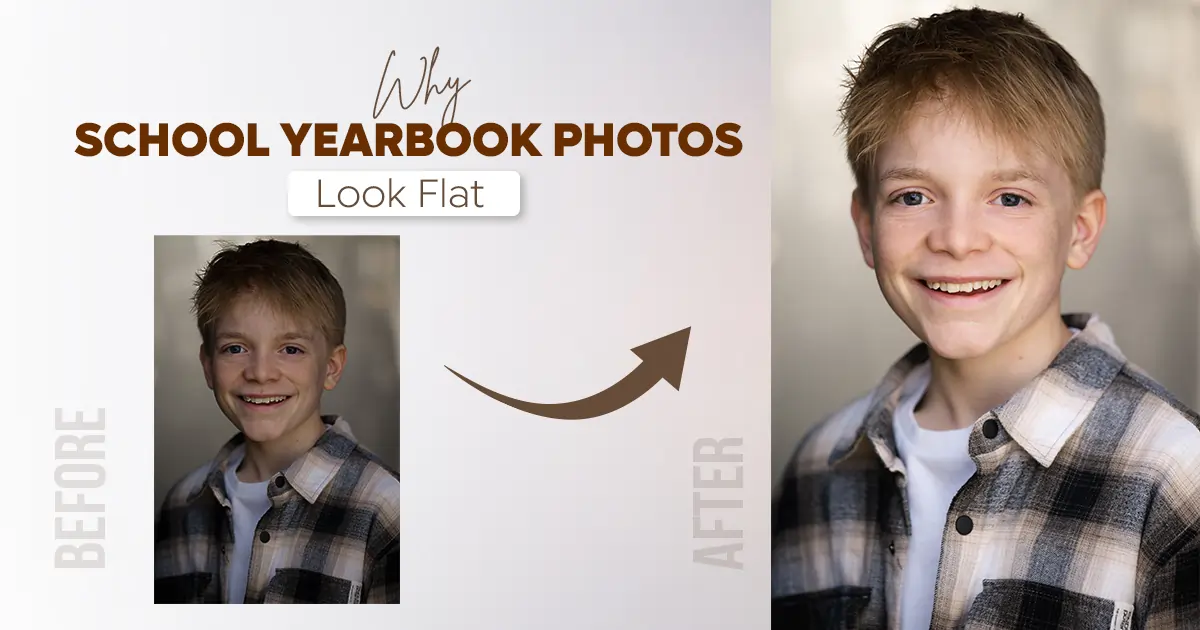
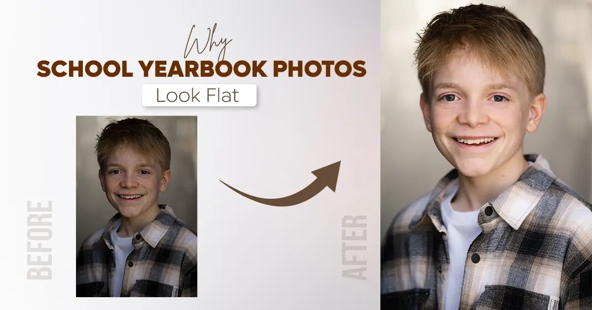
Hidden mistakes like over-smoothing skin, poor color correction, and editing for screens instead of print are quietly flattening your school yearbook photos.
Now, you know, it isn’t always the photographer. It’s what happens in the editing room. No worries. These problems are totally fixable when you know what to look for.
For your school, you can simply hire a photo retouching company to take over all the details. They will deliver the exact photos that your school needs.
Relatable Reads: AI Vs. Professional Retoucher: Which One is Better?
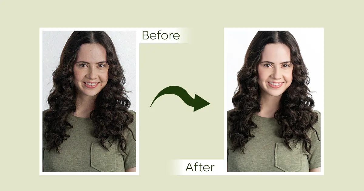
Mainly, the lighting, over-retouched, grayish print, and uneven skin tones are seen in school yearbook photos.
After opening the yearbook, the first impression you get is confusion. All you can think is, “Why does my face look so cartoonish”? Well, that’s what most students feel. Every year, from middle school yearbook photos to high school, students get into these frustrating problems.
We will talk about those school yearbook photo disasters.
Creating great middle school or high school yearbook photos is harder than it looks. The school manages hundreds of students. Then comes the photographer and the tight schedules. A lot can go wrong.
Here are the biggest headaches schools deal with:
Imagine you just walked from a sunny classroom to a dim hallway. That’s what gets shown on yearbook photos. Photographers take photos in different times and rooms. This changes the lighting completely.
Some classes might look bright, but others muddy. This makes the whole yearbook look inconsistent.
Why this matters: Your face shouldn't look completely different depending on which page of the yearbook you're on!
Some photo editors go a little too crazy with the editing tools. They smooth out every tiny detail and erase any natural expression from the student's face. The result? Students end up looking like plastic versions of themselves.
The real issue: Nobody wants to flip through a yearbook and not recognize half the people because their faces were edited so much.
You are eagerly waiting for the photos. Once you get your hands on them, they all look so flat. That's what happens with a lot of school yearbook photos. Most of the photos lose their shine during printing. All the kids seem pale and gray.
You can’t say it’s the student. The actual problem is with the photo editing or how it is printed.
The disappointment: After waiting all year for your yearbook, you look like the walking dead. The photos are so boring to look at!
When editors process a bunch of photos quickly, mistakes happen. One batch of photos might look too orange, while another looks too yellow. Some students' skin tones appear weird or unnatural because of editing mistakes.
Why it's a problem: Everyone deserves to look like their actual selves in their yearbook photo.
Here's where things get really messy. Many schools send their photos to outsiders who edit them. However, these editors don't always understand school timelines. A deadline that seems crystal clear to a school can get lost in translation when it goes to a third-party company. Files get mixed up, and edits take longer than expected.
The stress: Teachers and administrators end up pulling their hair out trying to track down photos and files. Students have no idea when their yearbook will actually arrive.
You want to get your hands on the yearbook. But you have no idea where to go:
Ask your school's yearbook advisor or main office. They usually keep copies or know where to find them.
Visit your school's website or social media pages to find photo galleries.
Ask any of your friends if they have the digital files from photo day.
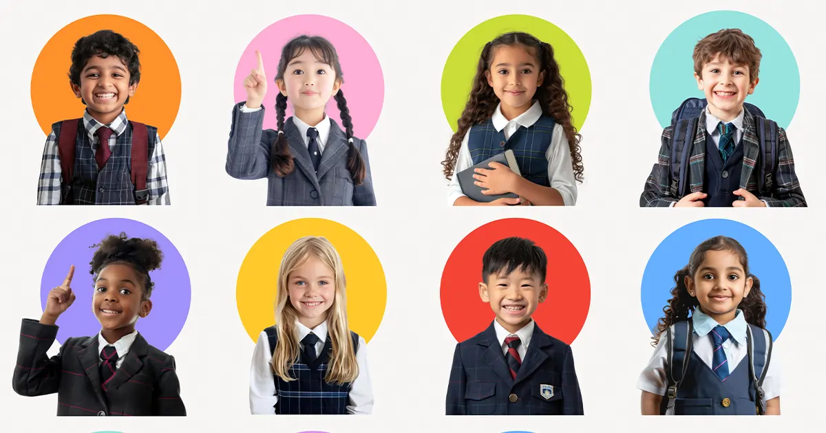
Why do some school yearbook photos end up looking totally different from what you expected? It's not always the photographer's fault. Sometimes, it’s the editor who didn’t edit the photo well.
Spotting the photo editing mistake on the computer screen is hard. However, it becomes super obvious when your high school yearbook photos finally get printed.
Let’s learn about those sneaky editing errors that ruin the school photos.
Some photo editors use automatic beauty retouching presets. What the editors do is just hit the button and let the computer do the work. Now the issue is, these presets make the photos unrealistically “perfect”. They blur and smooth every single detail. Literally, remove all the natural features that make you look human.
Why It's a Problem:
When you over-smooth skin, something weird happens. Students lose their individuality and authenticity. Flip through a yearbook's photos section, where you'll notice everyone looks kind of the same. Looks like they put a beauty filter.
The real impact: Your yearbook photo should make your friends say, "Oh, that's definitely you!" not "Wait, who is that?"
Here's where things get tricky. Let’s say editors have two different images under two different lighting conditions. One is a classroom with yellow fluorescent lights, and another is near a window with natural blue light. Instead of adjusting each one individually, they apply one global color correction to all the photos. It's faster, but it's also lazy.
Why It's a Problem:
When you use the same color correction for every photo, some come out looking way too pale or gray. The printed version looks really bad. Skin tones look washed out, lifeless, and sometimes even a little sick-looking.
The frustration: You looked great on photo day. However, your yearbook version looks like you've never seen the sun.
This is one of the trickiest mistakes. Many editors adjust brightness and contrast based on how the photo looks on their computer monitor. The problem? Screens are bright. What looks perfectly exposed on a screen can appear way too dark or muddy when printed.
Why It's a Problem:
Editors optimize for screen brightness instead of print output. When your photos finally get printed, all that careful editing suddenly looks dull and dark. The colors lose their punch.
The disappointment: You waited all year for this, and it comes out looking like it was printed in a dungeon.
Most yearbook photos use the same backdrop for everyone. What editors miss is that the backdrop's brightness and color don’t match. This makes the photo look weird and inconsistent.
Why It's a Problem:
Your eye bounces all over the place instead of actually looking at the students. The yearbook starts looking sloppy and unprofessional. It's all because the backgrounds weren't harmonized.
The eye-rolling moment: You're trying to look at your friends' photos. Sadly, you can't stop noticing how different all the backgrounds look.
Compare multiple photos side-by-side to see if skin tones look consistent
Check for the "plastic face" effect
Look at the backgrounds to make sure they're even
View sample prints on actual paper, not just on a computer screen
classroom, smiling at the camera while writing or studying
Down with what goes wrong with school yearbook photos. When it comes to the question of whether these issues can be solved, absolutely! These problems are definitely fixable.
First, let’s move away from the idea of too much “perfect”. Instead, photos should be edited to look real, natural, and emotionally warm. No need to overprocess them. Just capture the photos with better lighting and a little cleanup.
How To Do That:
Keep natural texture in skin (freckles, features)
Enhance, don't erase. Smooth out blemishes and uneven lighting.
Maintain authenticity. Your genuine smile and expression matter way more.
Show diversity. Different skin tones, features, and styles.
The result: When you flip through the yearbook, you see real people whom you recognize and connect with.
Schools have hundreds, sometimes thousands, of student portraits to edit. The old way was to either hire tons of people or use automation. However, there is a better way to do that.
How It Works:
Smart batch processing groups similar lighting conditions together.
Automated quality checks catch obvious mistakes.
Human review to catch mistakes machines miss
Team consistency ensures that the same editing standards apply to every photo.
The advantage: Schools receive consistent quality without paying for individual hand-editing of each image.
One of the biggest hidden mistakes we talked about earlier. Editors optimize for computer screens instead of print. This is actually pretty easy to fix. Just remember that yearbooks get printed on paper, not displayed on phones.
What This Requires:
Color profiles for print are built into the editing software
Regular proofs on actual paper before final printing
Exposure calibration for print brightness
Skin tone consistency that survives the printing process
The difference: Compare a yearbook edited the old way to one edited with print profiles in mind, and it's like night and day.
The final piece of the puzzle is actually getting the yearbooks printed and delivered. Right now, a lot of schools deal with a nightmare of missed deadlines and lost files. This doesn't have to happen.
What To Do:
Clear timelines set up months in advance, with no surprises
Project management software that tracks every photo and file
Communication checkpoints so schools know exactly where things stand
Buffer time built in for unexpected issues
Dedicated support that understands school schedules
The benefit: Students shouldn't have to wait until June to get a yearbook that was supposed to arrive in April.
Relatable Reads: Smartphone vs Professional Photography: Which One is Better?
Yes, that’s the bottom line. Stop getting lifeless school yearbook photos that make everyone look the same. To help you with that, Retpix has brought all the solutions in one service.
When schools work with RetPix, students get yearbooks where they actually recognize themselves. Colors are vibrant, skin tones are natural, and everything is consistent from page to page. Get yours done with affordable cost and on time.
School yearbook photos should look all natural and polished. The faces need to be highlighted clearly. Even lighting, a neutral background, and minimal photo retouching are what make the school portrait look professional.


RetPix, MB is a private company registered in Lithuania (No. 306112201) with VAT ID LT100015912712. We are delivering high-quality photo retouching, graphic design, and video editing services worldwide with a focus on precision and client satisfaction.
Follow Us
 English
 Arabic
 Danish
 Dutch
Dutch
 Finnish
 French
 German
 Hebrew
 Croatian
 Czech
Czech
 Greek
Greek
 Ukrainian
 Estonian
 Hungarian
 Turkish
 Italian
 Japanese
 Norwegian
 Polish
 Portuguese
 Romanian
 Spanish
 Swedish
 Russian
 Latvian
 Lithuanian
 Serbian
 Slovak
 Slovenian
 Luxembourgish